Times - Time spent on site
Guide for:

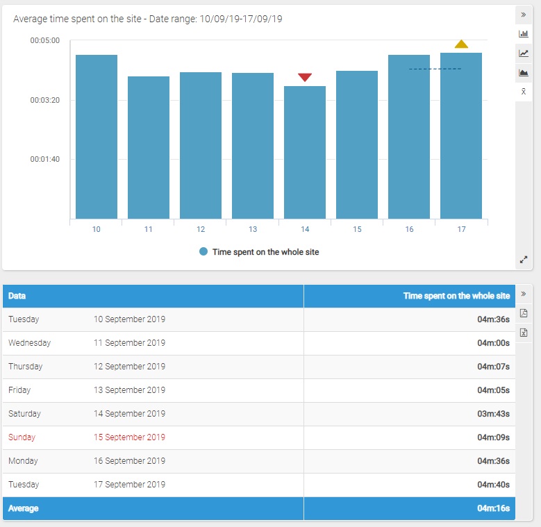
The report named "Time spent on site" shows the average time your visitors have spent browsing your site.
The first table shows the average time and the trend for the period.
In case more values are being compared, you will be shown the corresponding average and trend.
Filters
- Calendar: it allows you to select the time interval for which you want to analyse the traffic data. For more info, click here.
- Compare with: feature: thanks to this feature you can compare up to three values selected among the available options.
Chart
On its horizontal axis, the chart shows the days or the months of the represented period and, on the vertical axis, the time spent on the site.
It is possible to change the type of graph by clicking on the icon on the right (bar, line and area graphs).
For periods that include at least 8 days, by clicking on the "Show/hide mobile average" icon, you can respectively show or hide the mobile average, displayed with a dotted line.
Selecting a period that includes today and no longer than 122 days, the real time data and the daily forecast for the current day are represented in different colors.
Table
The table shows the average time spent on the site.
In the last line, the average time spent on the site in the selected period is indicated.
For periods that include more than 122 days, the data are represented on a monthly basis rather than daily and the last two columns show the percentage of variation with reference to the previous month (in the first column) and with respect to the same month of the previous year (in the second).
Clicking on the name of each month you can view the daily details.
Selecting a period that includes today and no longer than 122 days, the last two lines of the table show real time data and the daily forecast for the current day.