Mobile Analytics - Time spent on site
Guide for:

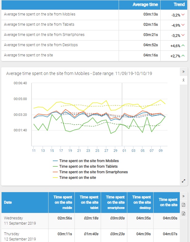
The report named "Time spent on site" shows the average time your visitors have spent browsing your site from mobile devices.
The first table shows the following data:
- Average time spent on the site from Mobile Devices
- Average time spent on the site from Tablets
- Average time spent on the site from Smartphones
- Average time spent on the site (independently from the device)
- Value
- Trend (selecting a time period longer than 28 days)
Filters
- Calendar: it allows you to select the time interval for which you want to analyse the traffic data. For more info, click here.
Chart
On its horizontal axis, the chart shows the days or the months of the represented period and, on the vertical axis, the time spent on the site.
In details, the chart shows the average time spent on the site from Mobile Devices, from tablets, from smartphones and the total average time spent on the site (independently from the device) in the selected time period.
For the 'latest 31 days' and 'latest 3 months' intervals, it is possible to choose a different graph chart by clicking on the icon corresponding to the graph type (Flash, bar or line chart).
Moreover, for intervals no longer than 6 months you will be shown a dotted line representing the 7-day mobile average.
For the other intervals, you will be shown only the 7-day mobile average, except for flash chart that shows the daily data for any period of time.
Table
The table shows the following data retrieved according to the selected time interval :
- Date: the day or the month under examination
- Average time spent on the site from Mobile Devices
- Average time spent on the site from Tablets
- Average time spent on the site from Smartphones
- Average time spent on the site from Desktop Devices
- Average time spent on the site (independently from the device) for each day (or month) in the selected period.
Click on the name of a month to view the daily data.
Please Note:
* Data on traffic split by tablet and smartphone is available since February, 12th 2015.
It isn't possible select time periods starting before this date.